Where the “Grass” is Greener
Client: Indo Expo
+ Brand Development & Art Direction
+ Advertising & Marketing Campaigns
+ Content Strategy & Creation
+ Social Media Marketing Campaigns
Challenge
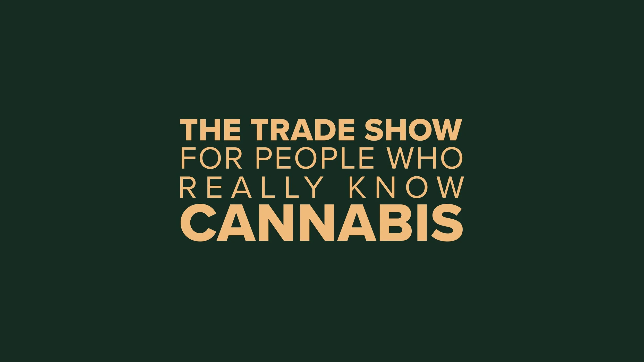
Tasked with solidifying our client's position as an industry leader in a rapidly flourishing market, we aimed to elevate Indo Expo’s brand, while upholding its original grassroots identity.
Approach
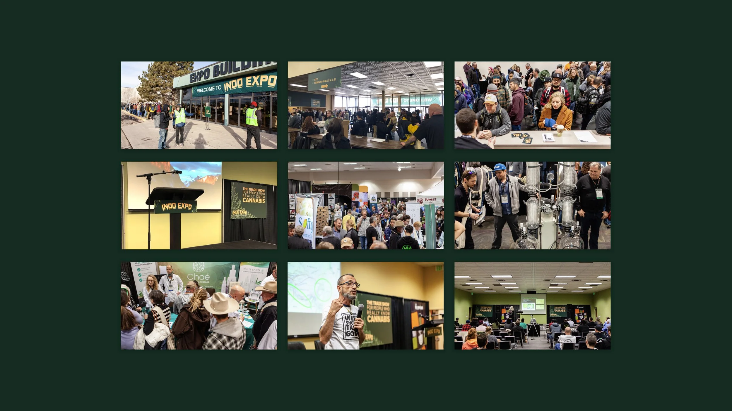
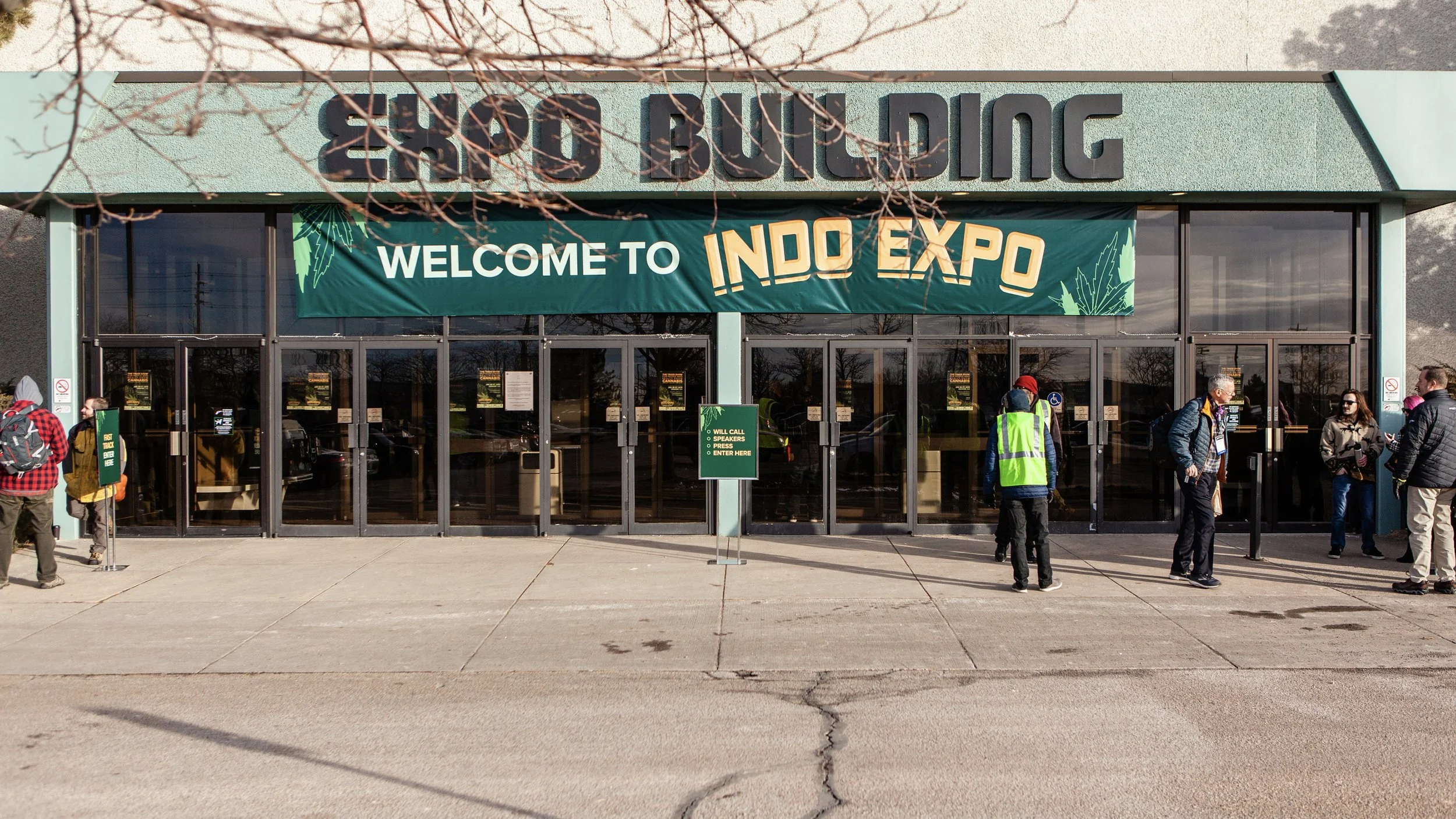
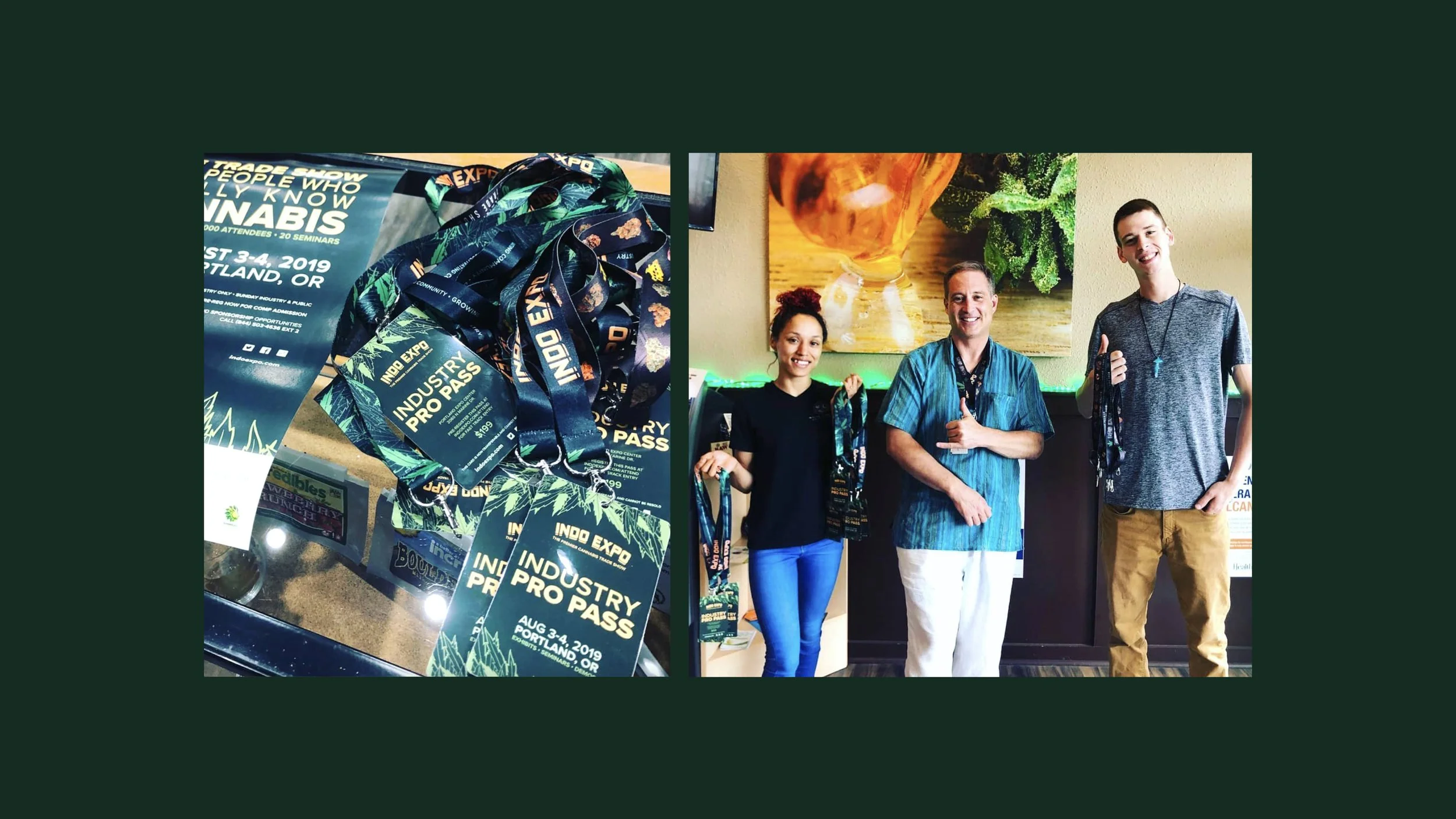
To foster authenticity, our approach focused on immersing ourselves in cannabis culture through on-site visits, team interviews, retail excursions, and partnerships with designers embedded in the cannabis community.
Results
Our newly refreshed brand and digital ad campaign in each market achieved a 300% higher click-through rate compared to the national average, leading to a significant increase in event attendees, exhibitor spending at each show, and it has paved the way for our expansion into new cities.
Solutions
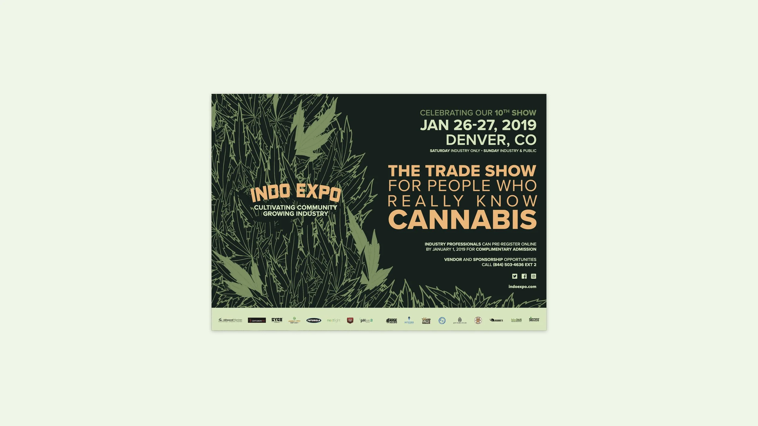
We infused the heritage of cannabis street culture with the latest trends in modern packaged goods and current cannabis retail, evolving the visual identity system to modernize its look while staying authentic to its roots.
“You guys are awesome!!!”
— Chris Olson, Executive Director & Founder
Creative Strategy
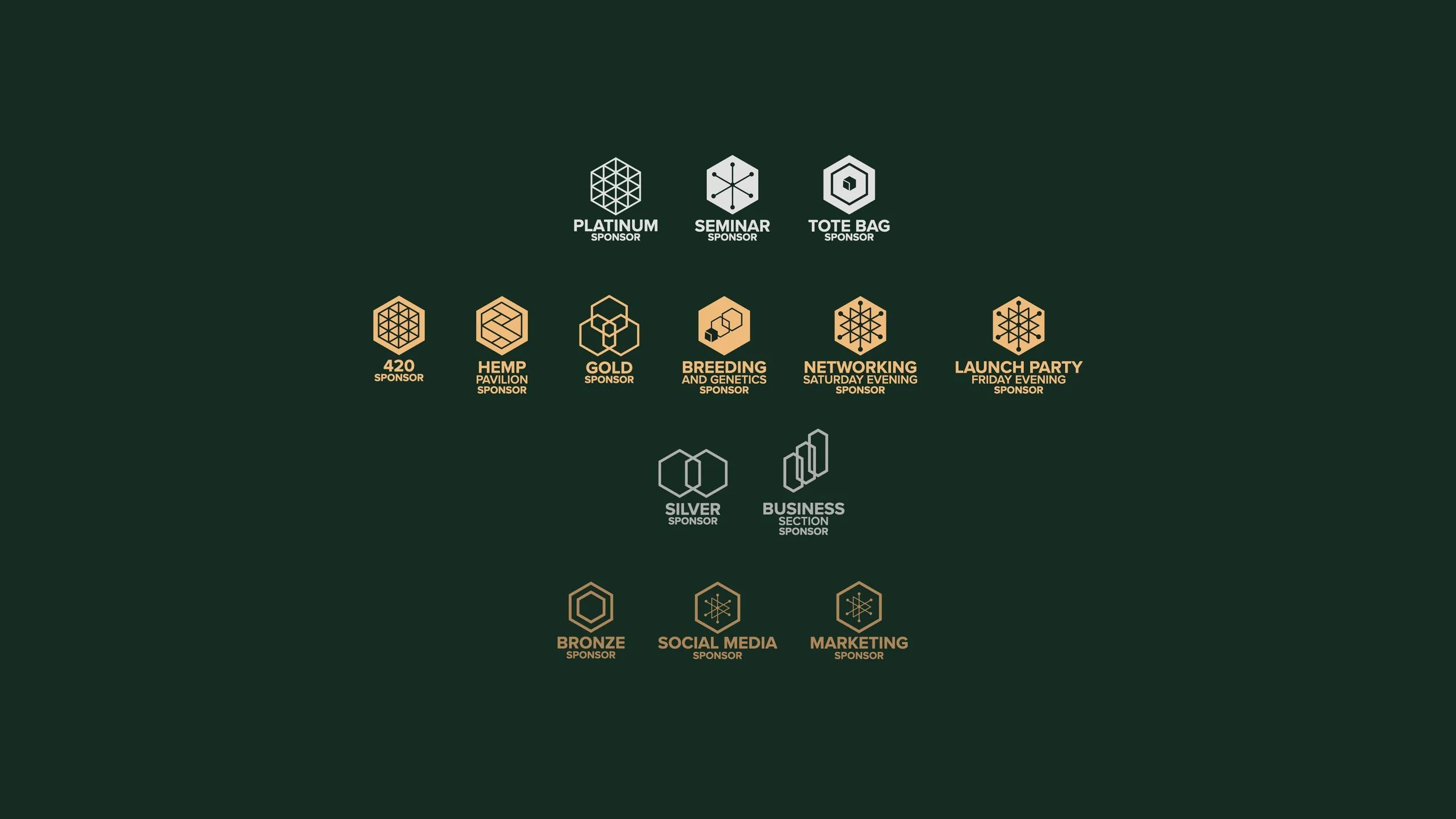
Our creative strategy was designed to reinforce our client's position in the marketplace by crafting a brand identity that set them apart from the competition, instilling a unique and captivating personality into their products or services. We elevated the perceived value of their offerings through a broad and flexible approach that allowed for growth and evolution, while ensuring consistency across all touch points to create a cohesive and memorable brand experience.
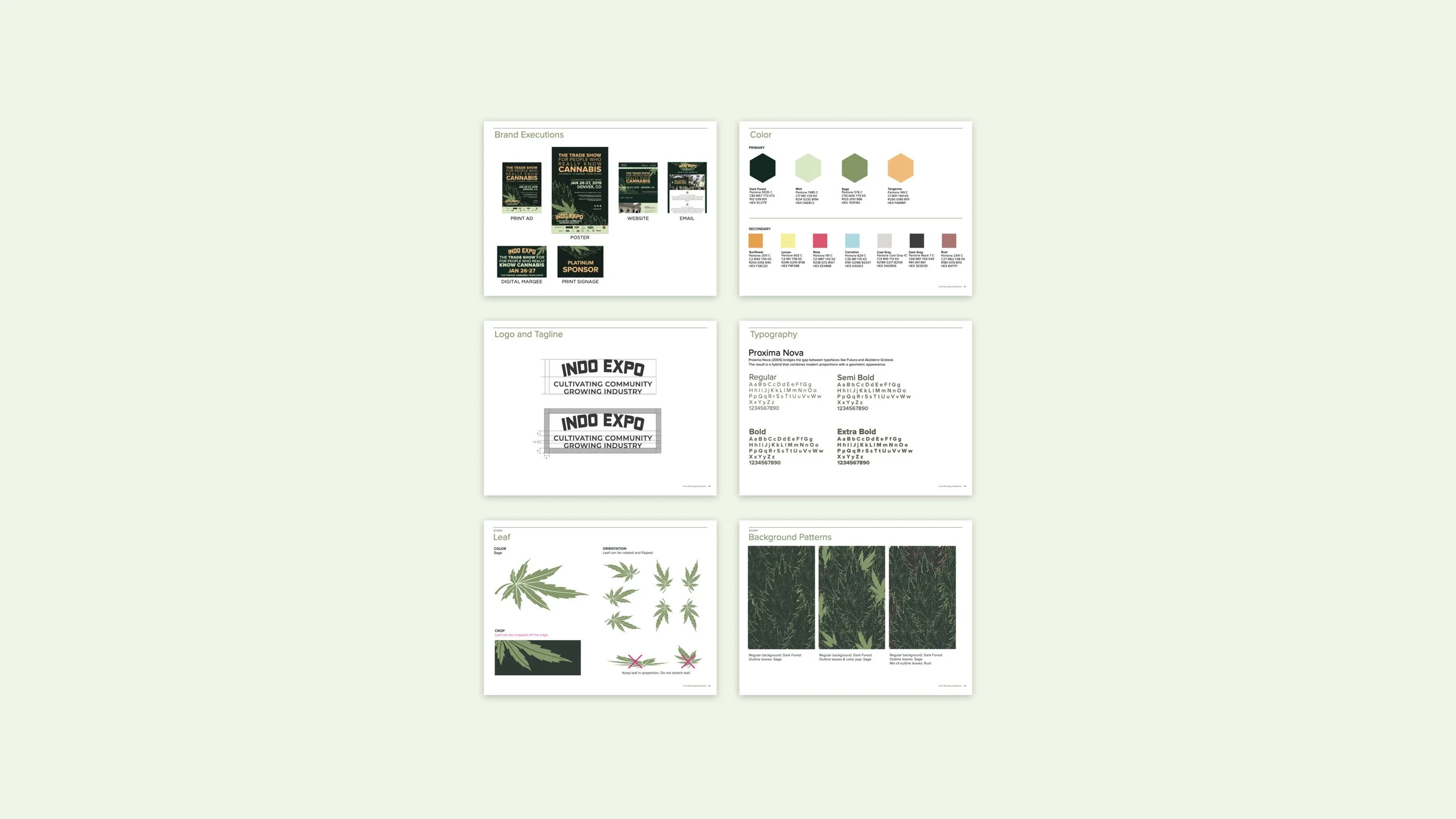
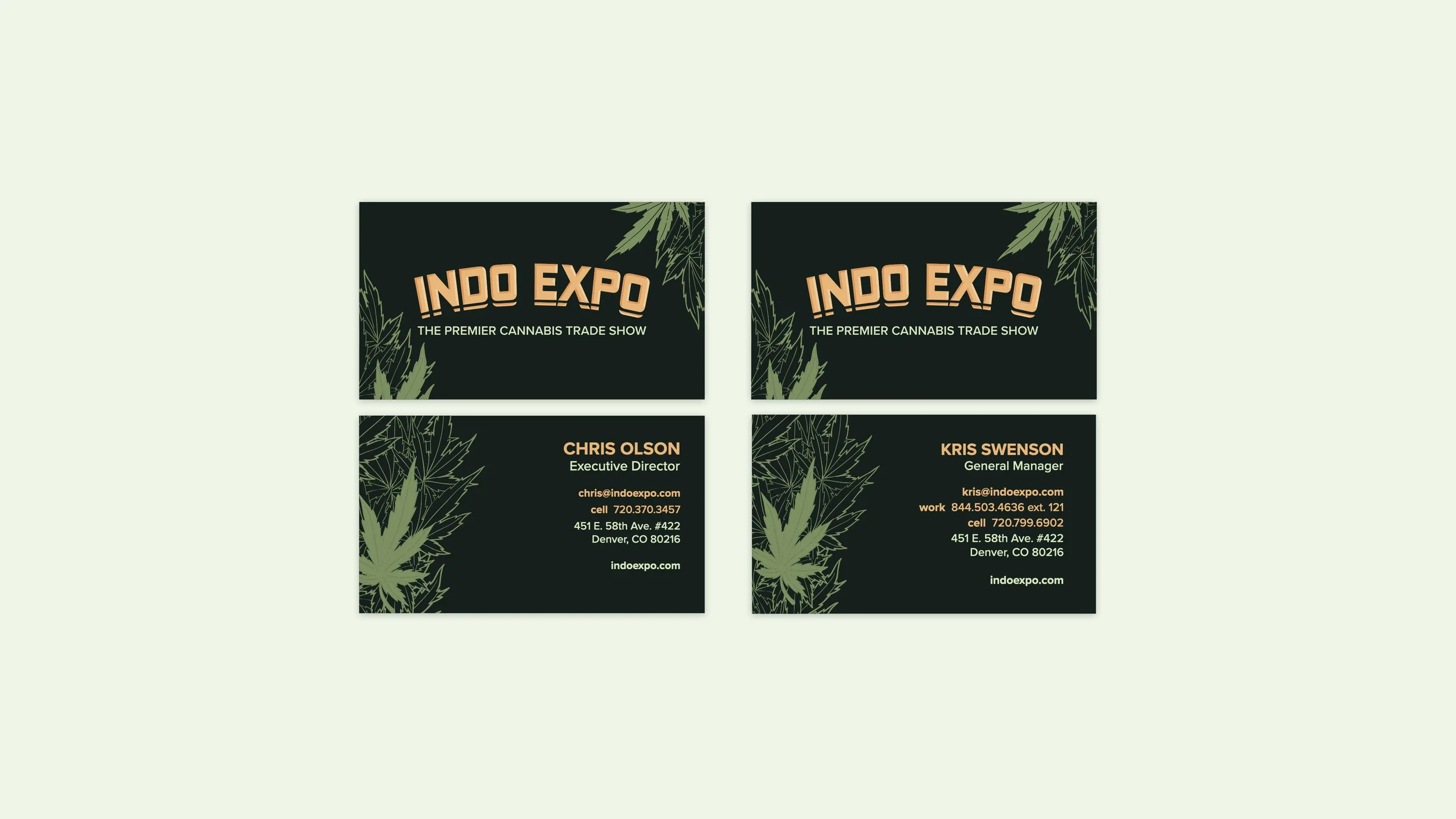
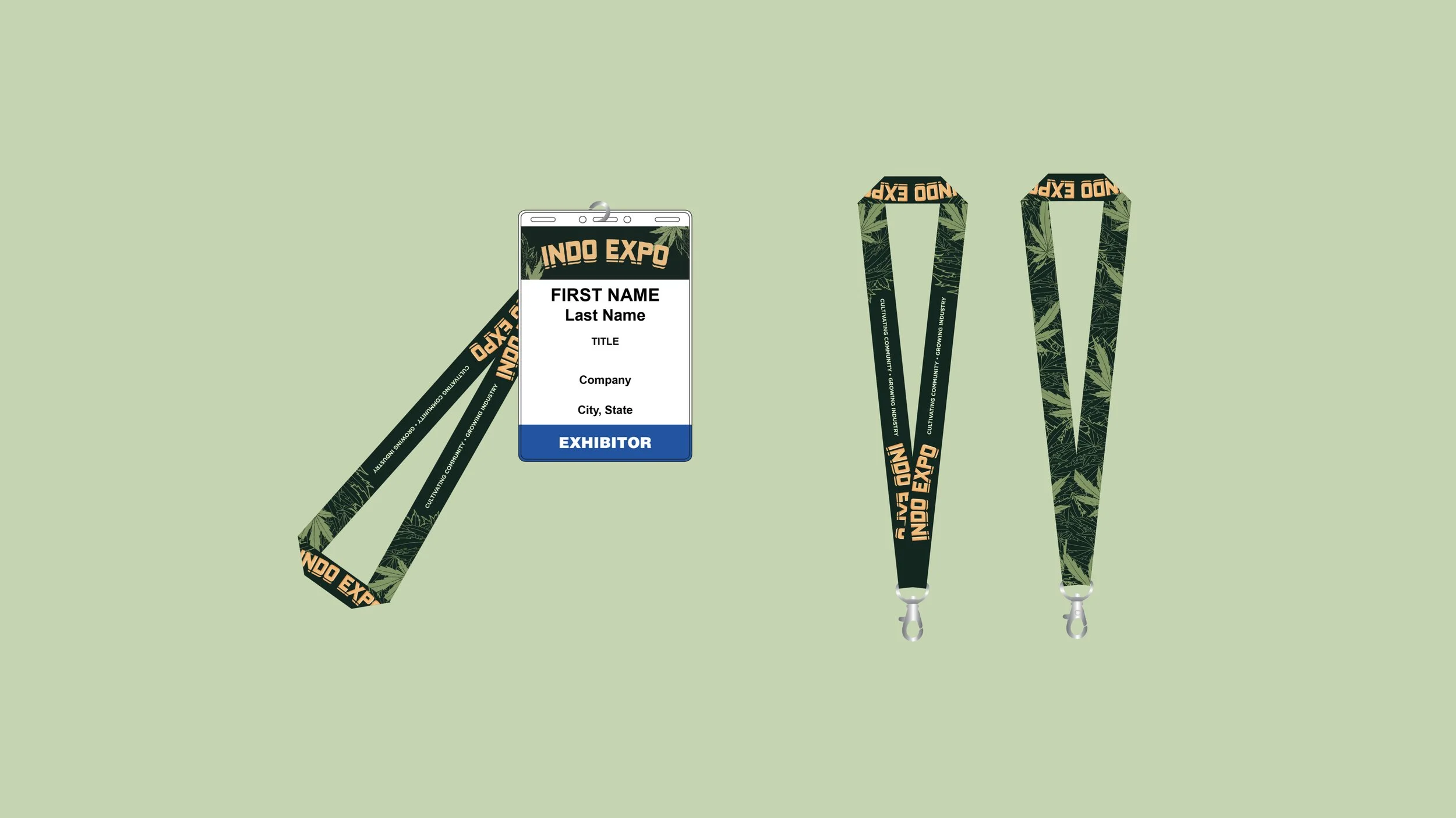
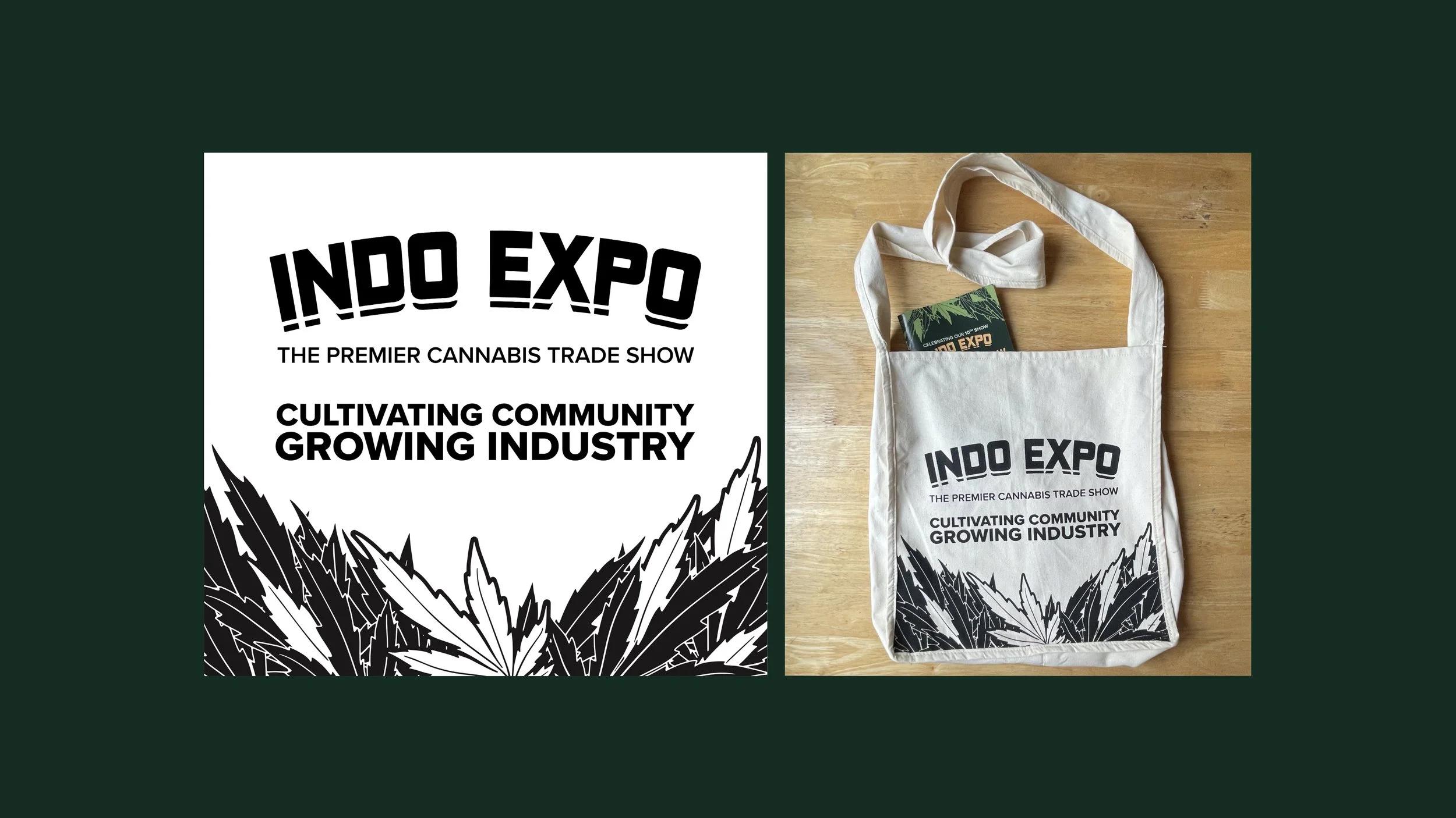
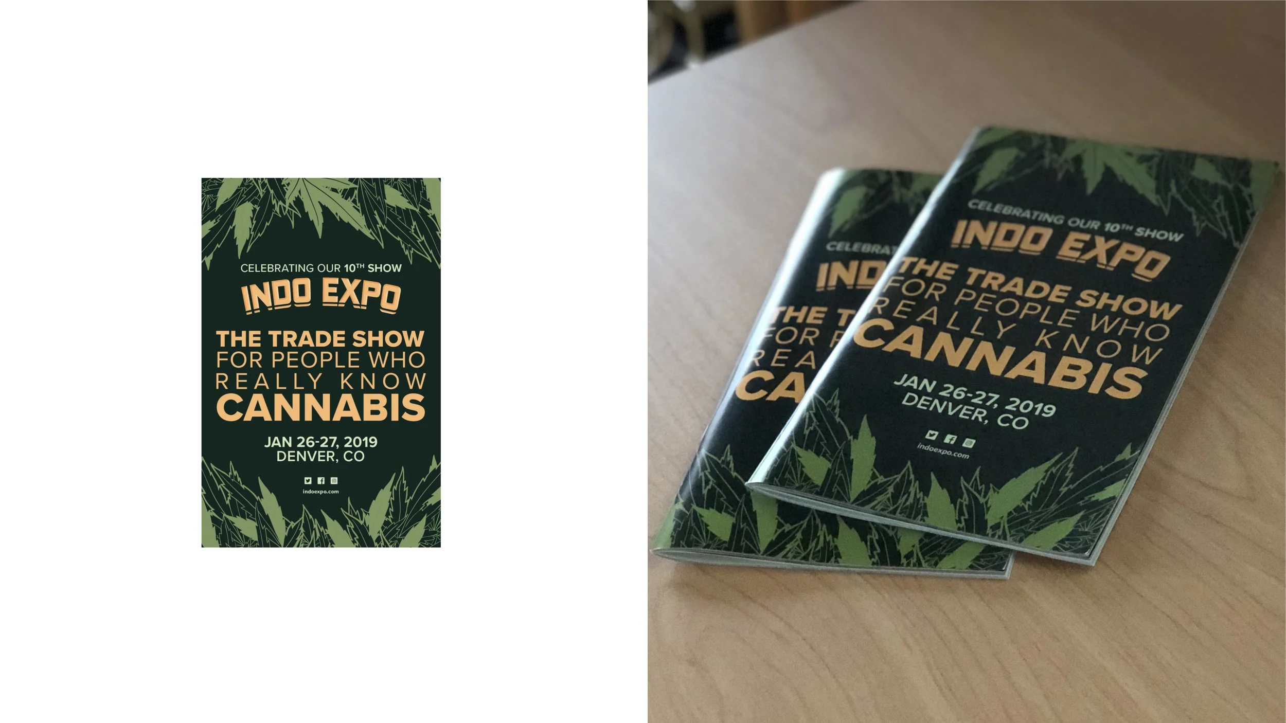
Logo Refinement
By building upon the original Indo Expo logo elements, we were able to preserve the inherent brand equity. We ensured flexibility by exploring various rendering styles, moving away from the limiting metal material while allowing for the incorporation of textured or photographic elements when necessary.

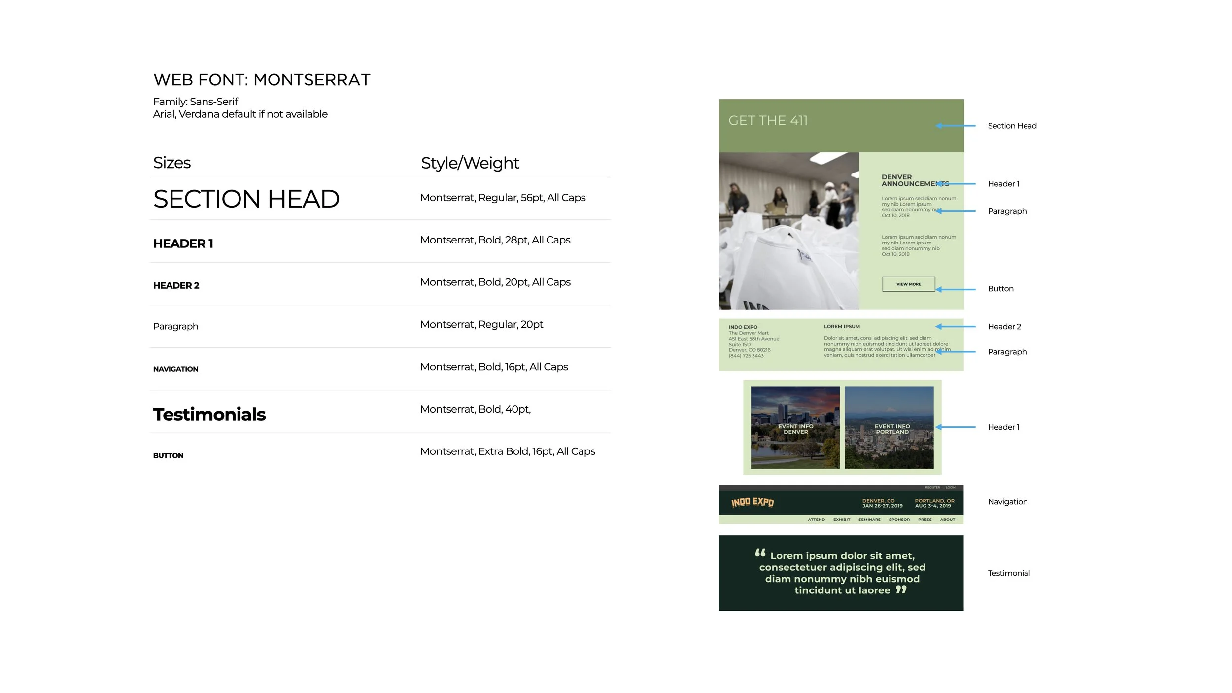
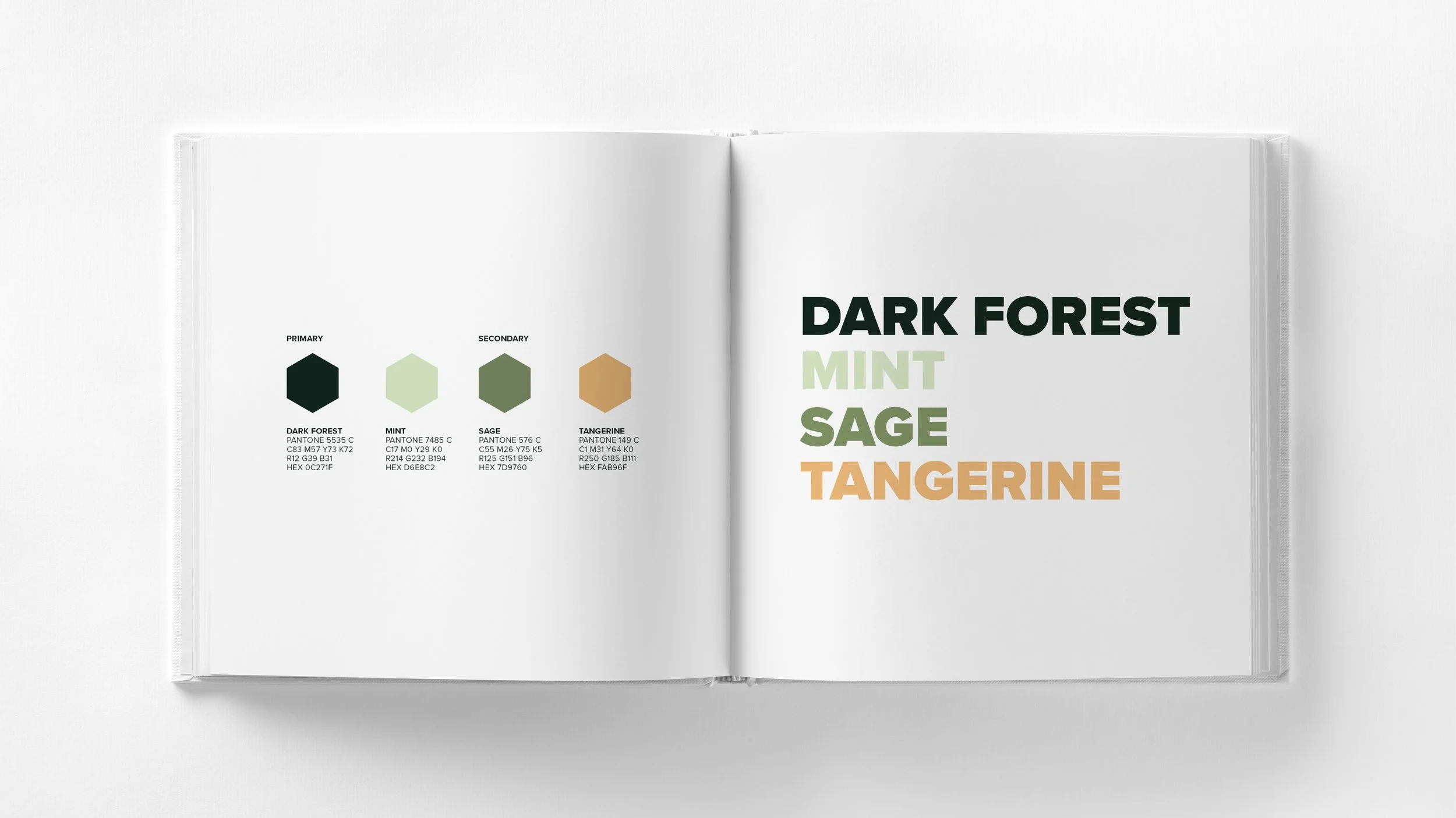
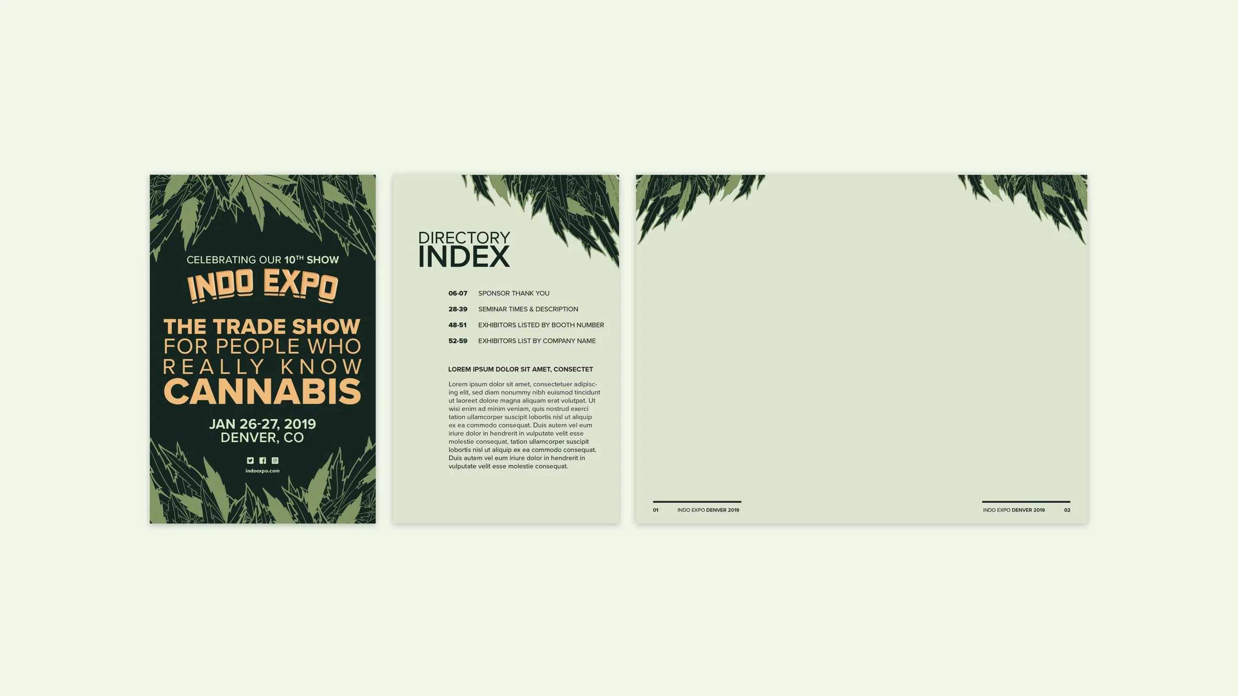
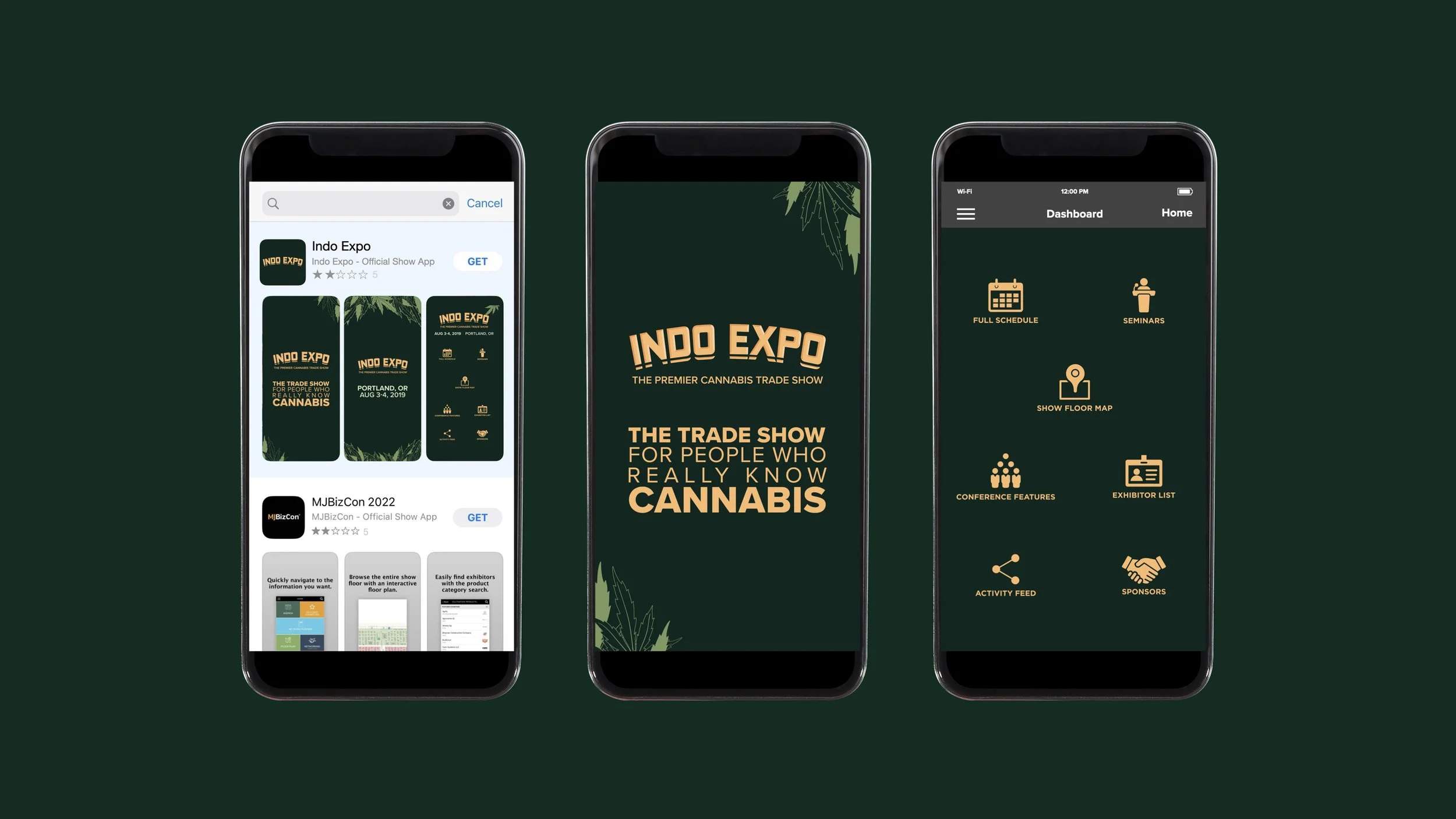
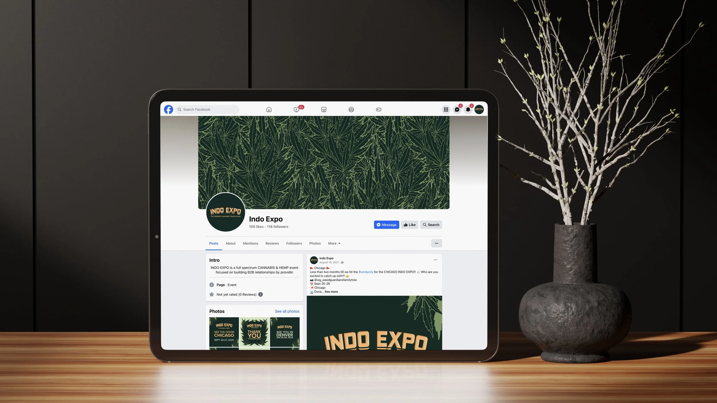
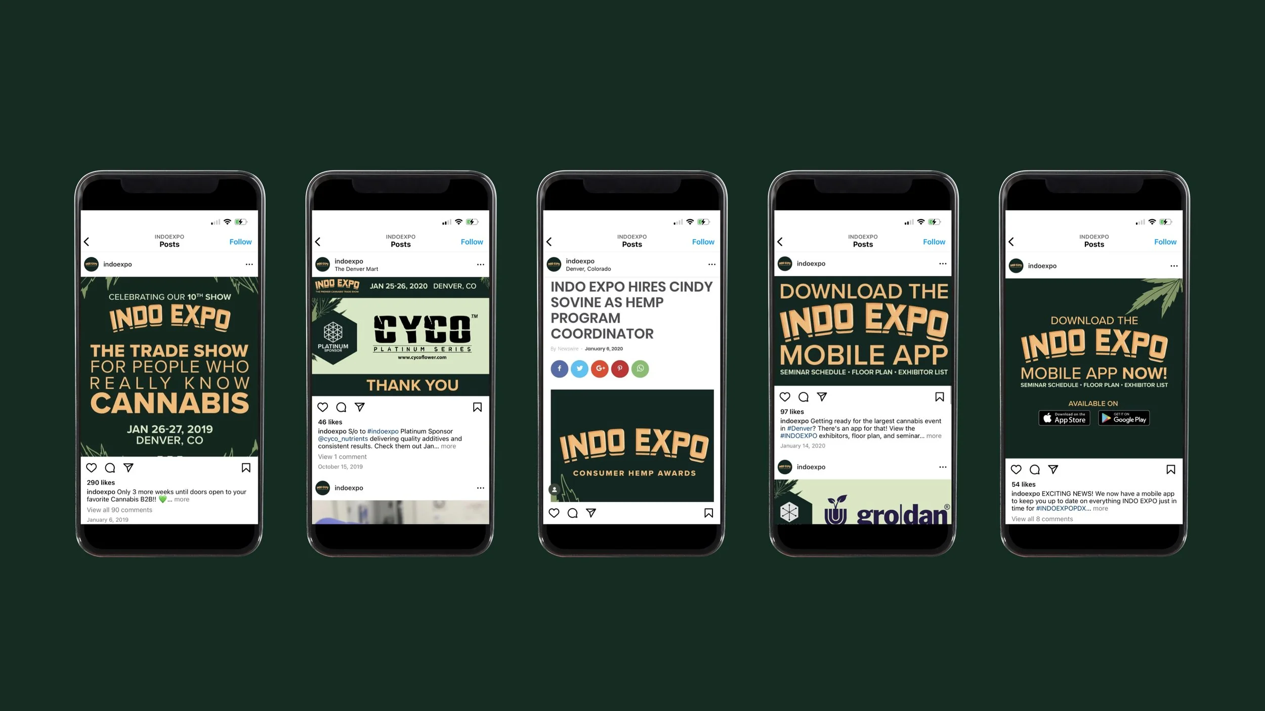
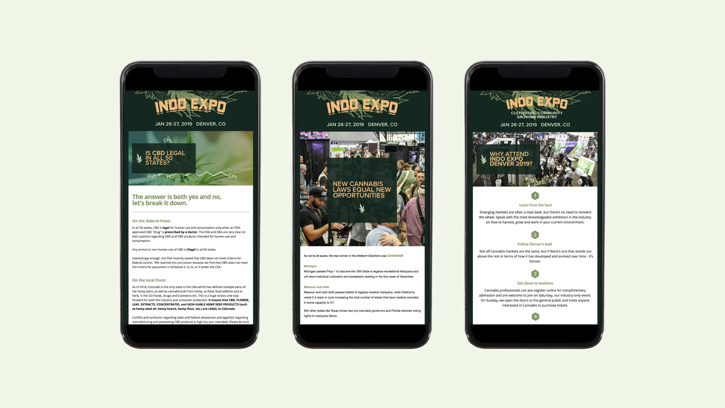
Visual Identity System
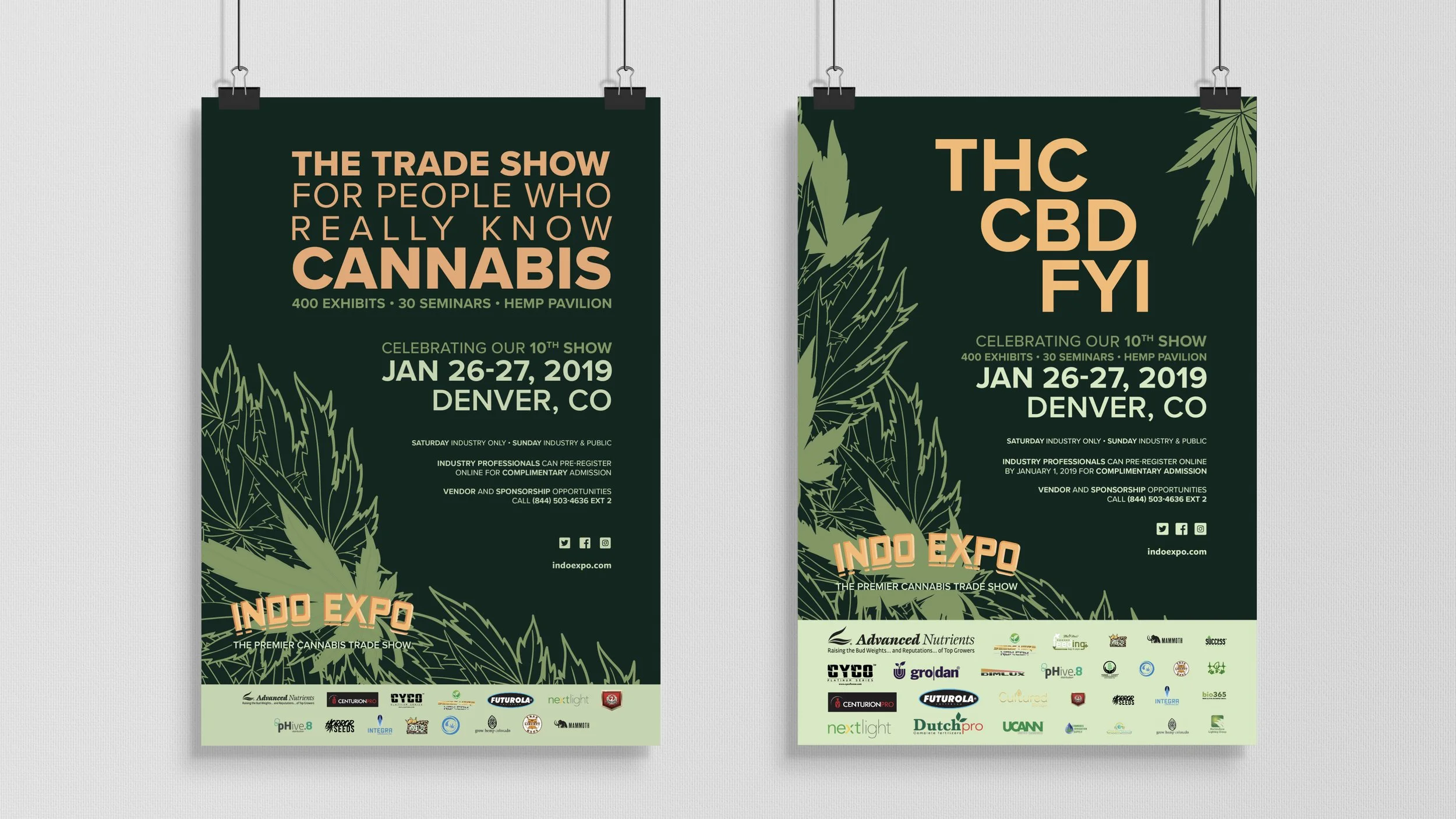
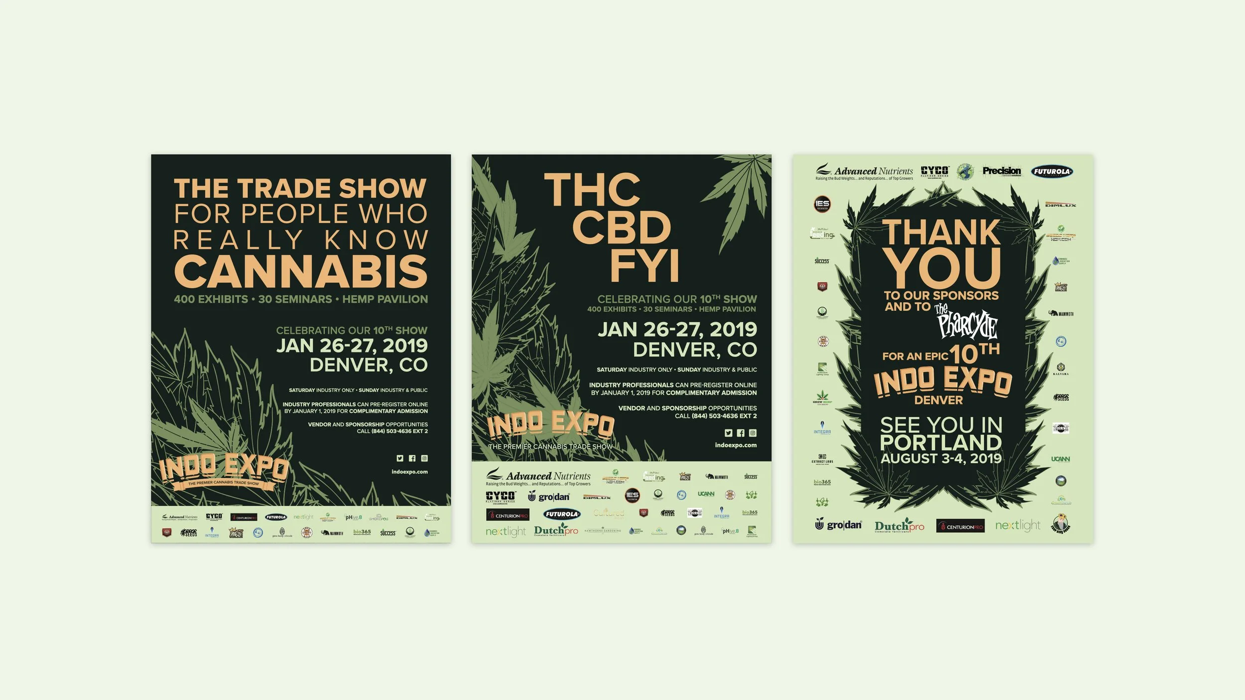
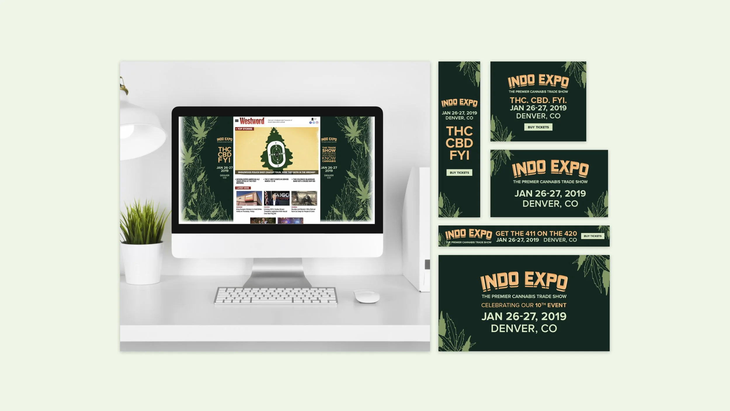
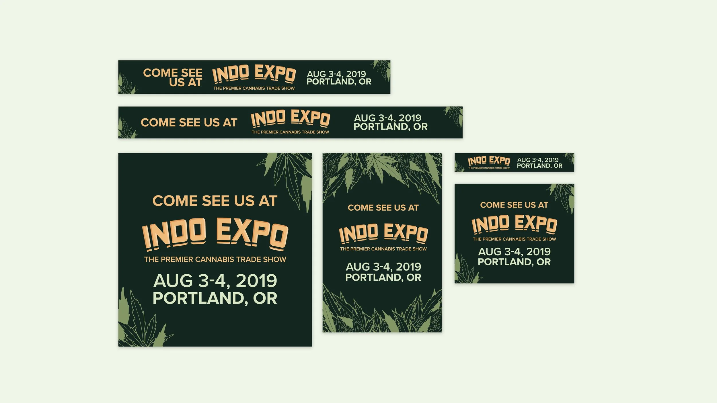
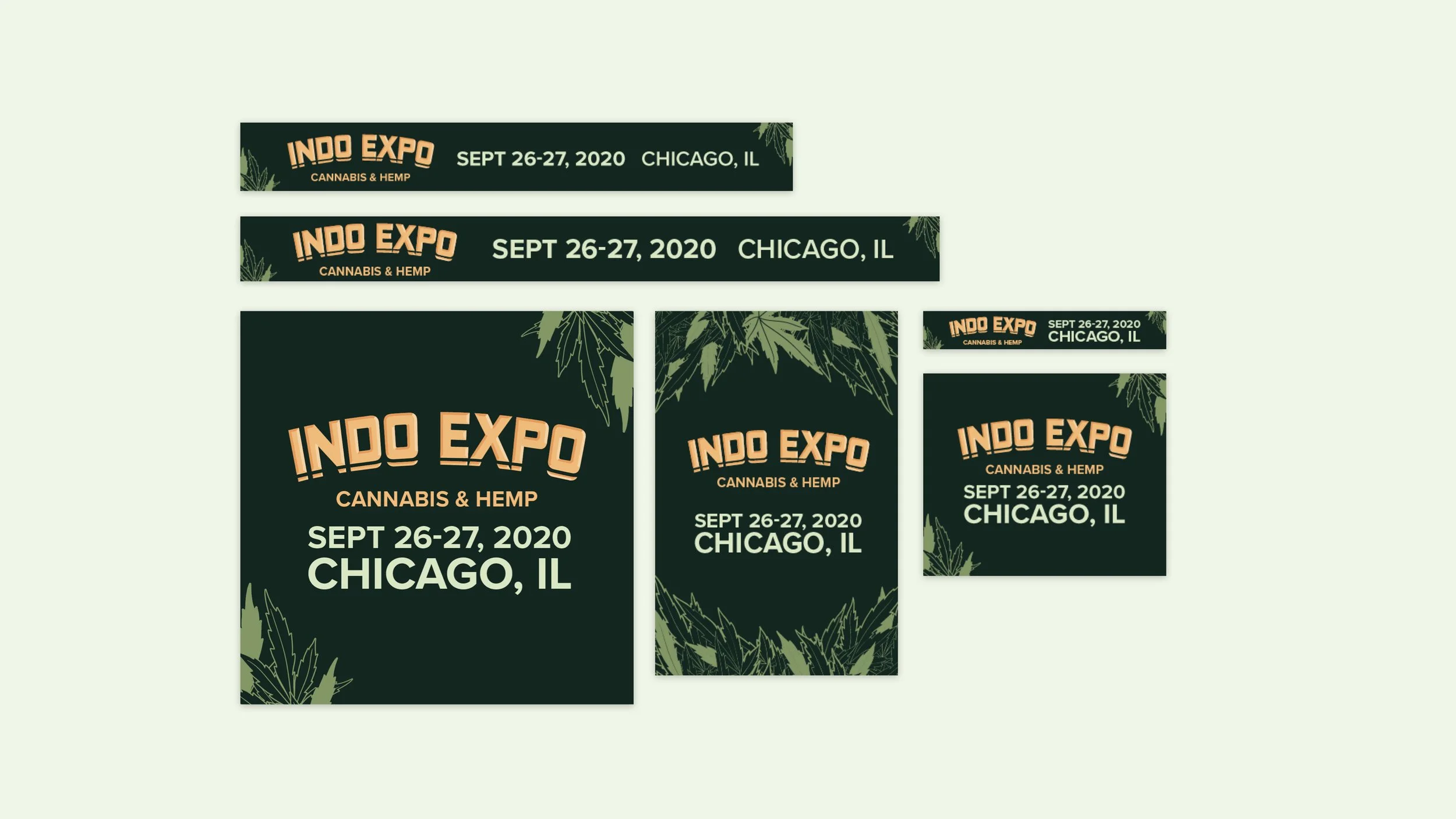
We employed a dark and sophisticated tonal green palette, highlighted by tangerine. The brand's modern and clean approach features iconic cannabis leaf illustrations grounded on solid backgrounds, paying homage to its cultural roots while embracing forward-looking ideals.


Design
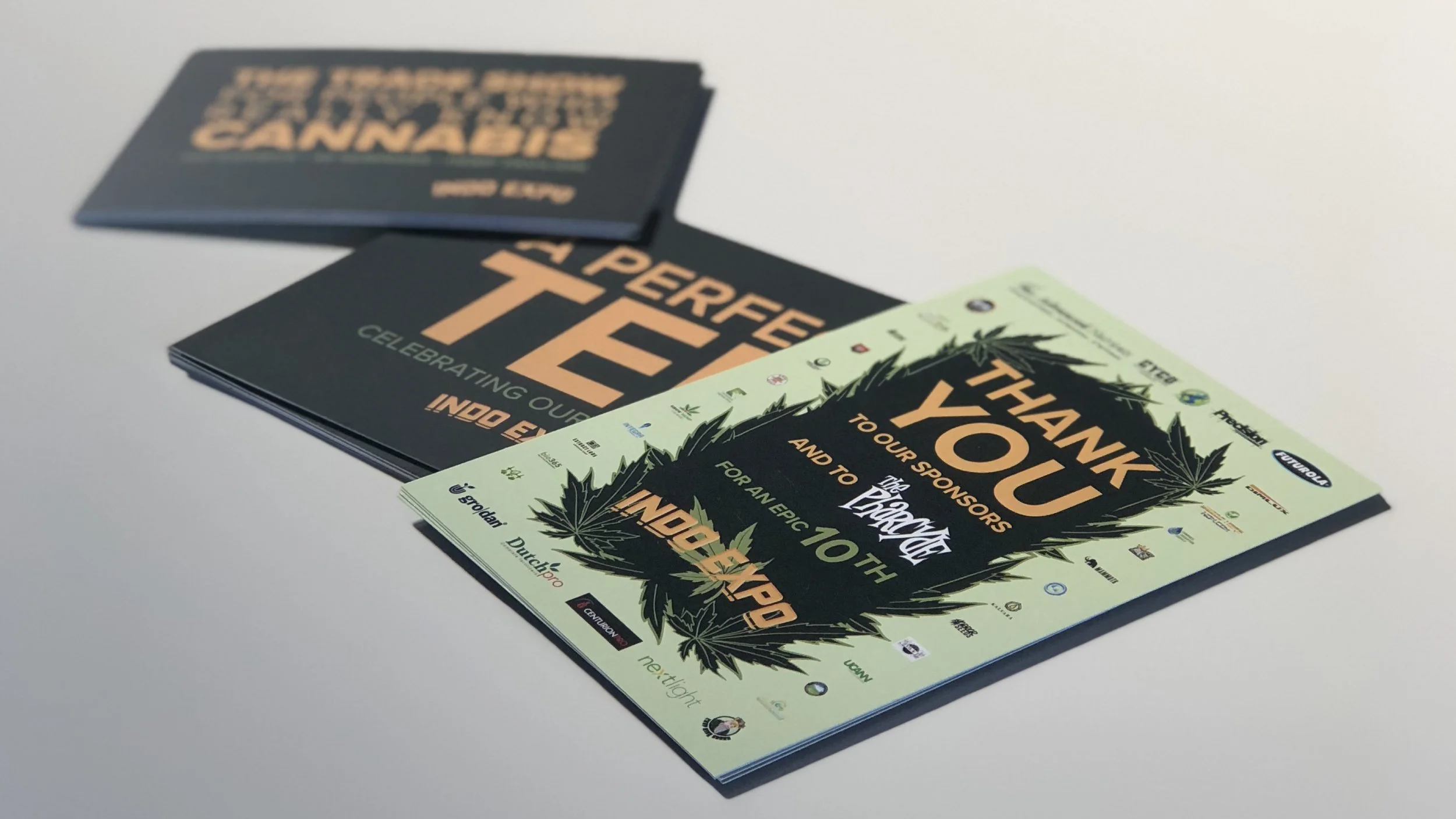
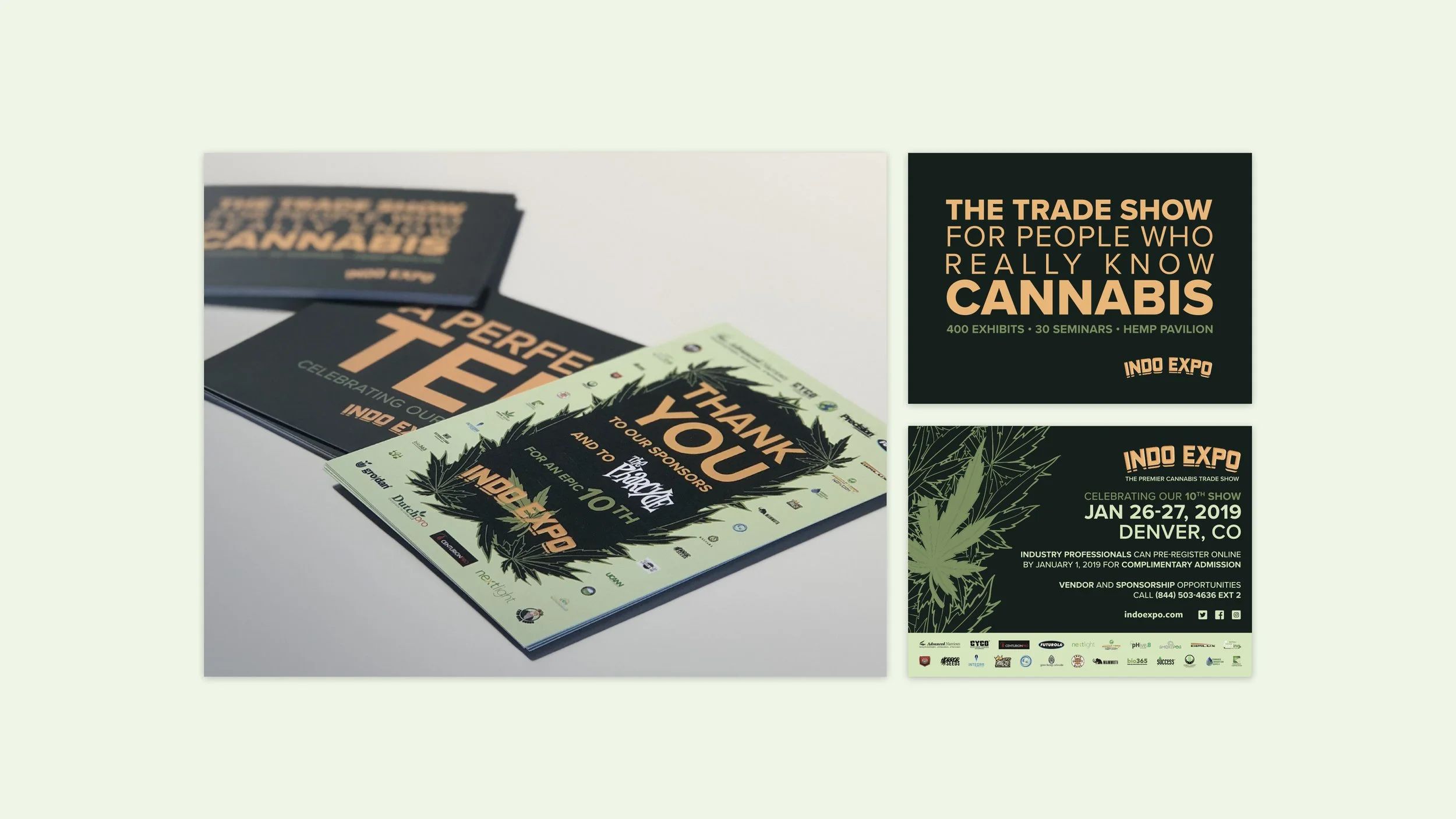
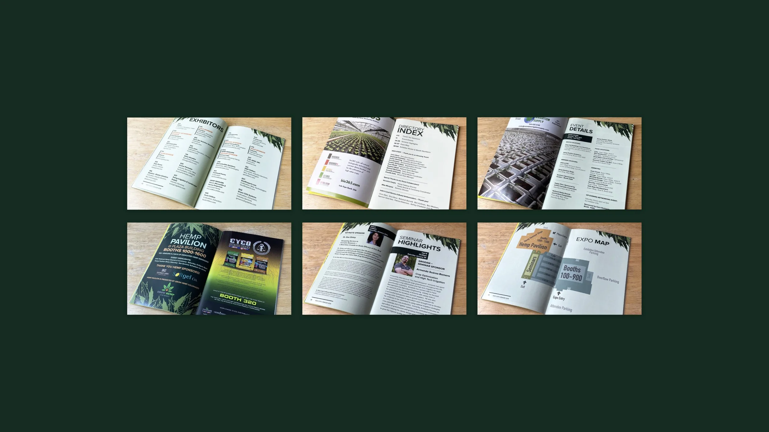
Show Book
Print & Digital Advertising Campaign
Marketing Collateral
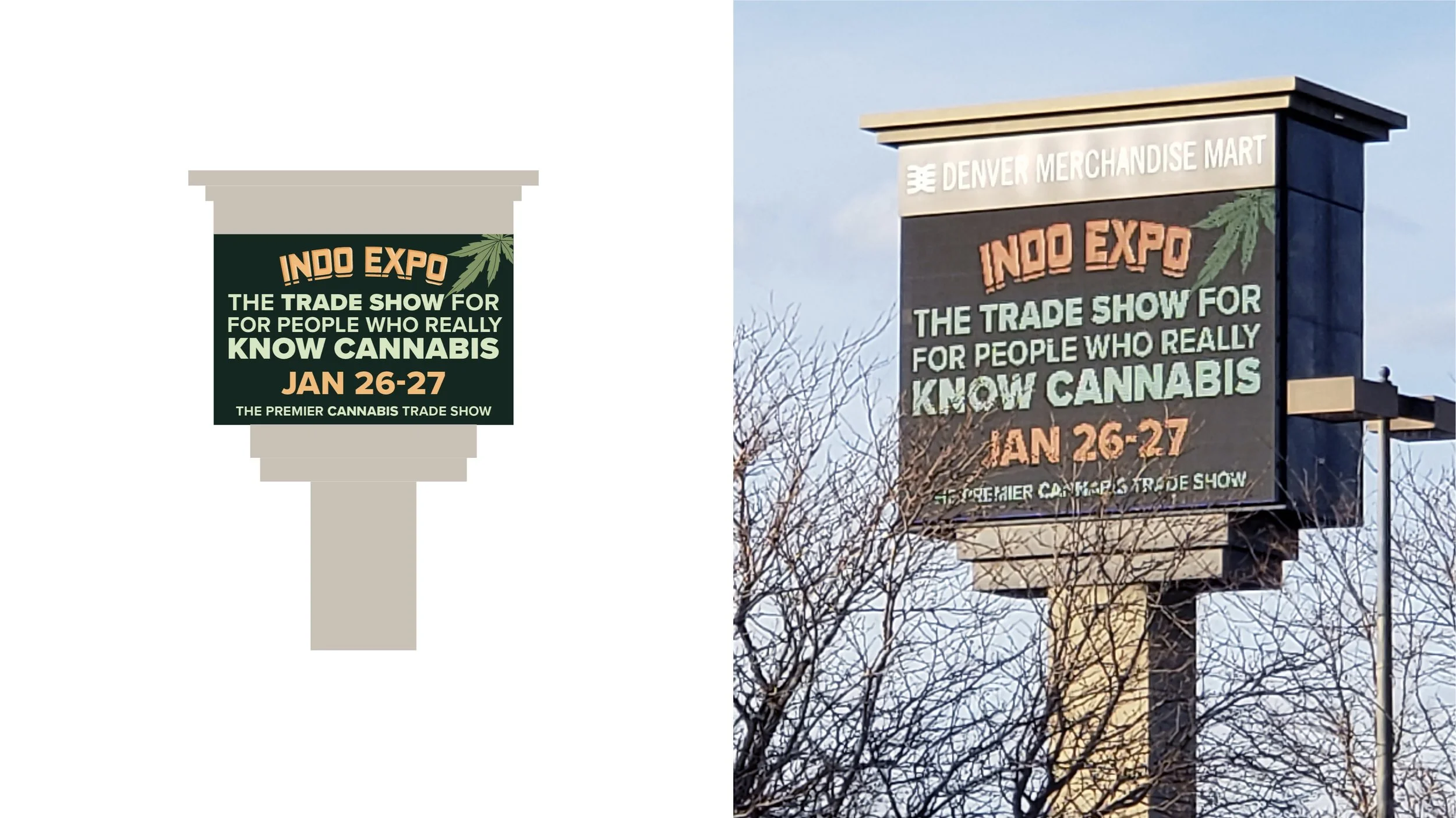
Signage
OOH

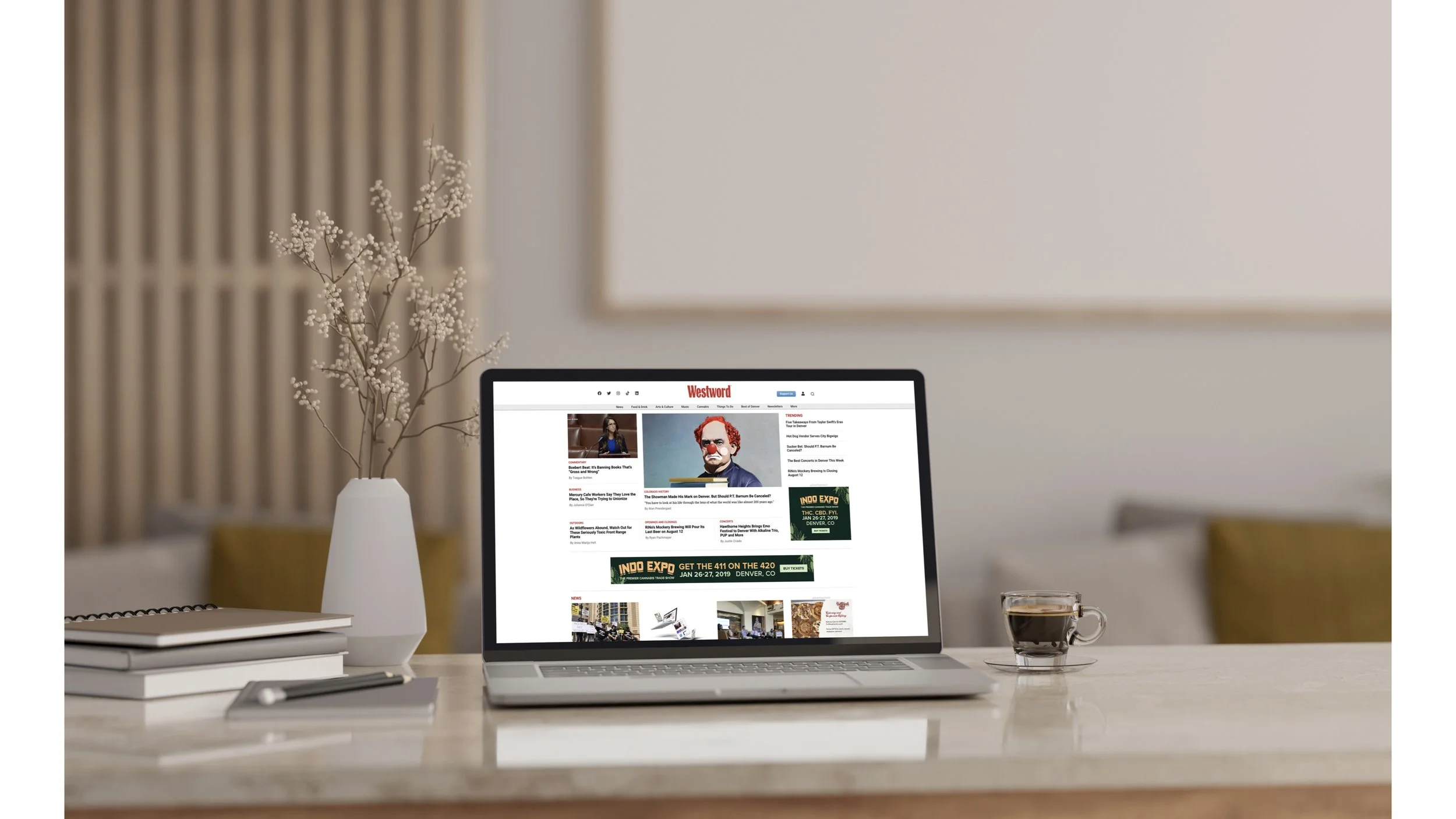
Digital Marketing
Digital Advertising Campaign
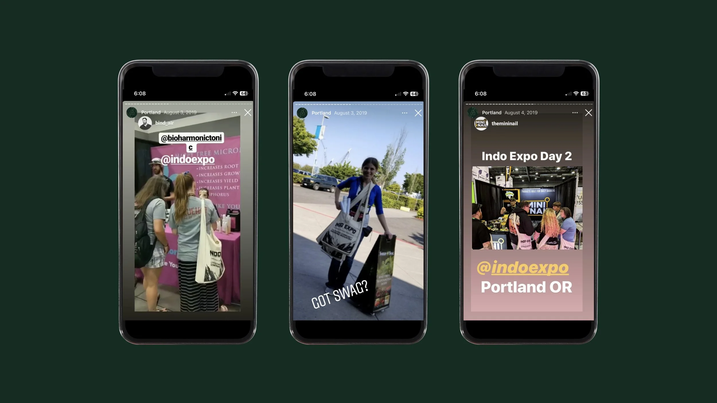
Social Media Campaign
Website Takeovers
Phone App
OOH


Email Marketing
Email Marketing Strategy
Email Templates, Graphics, Banners
Analytics and Reporting
Integration with Other Channels

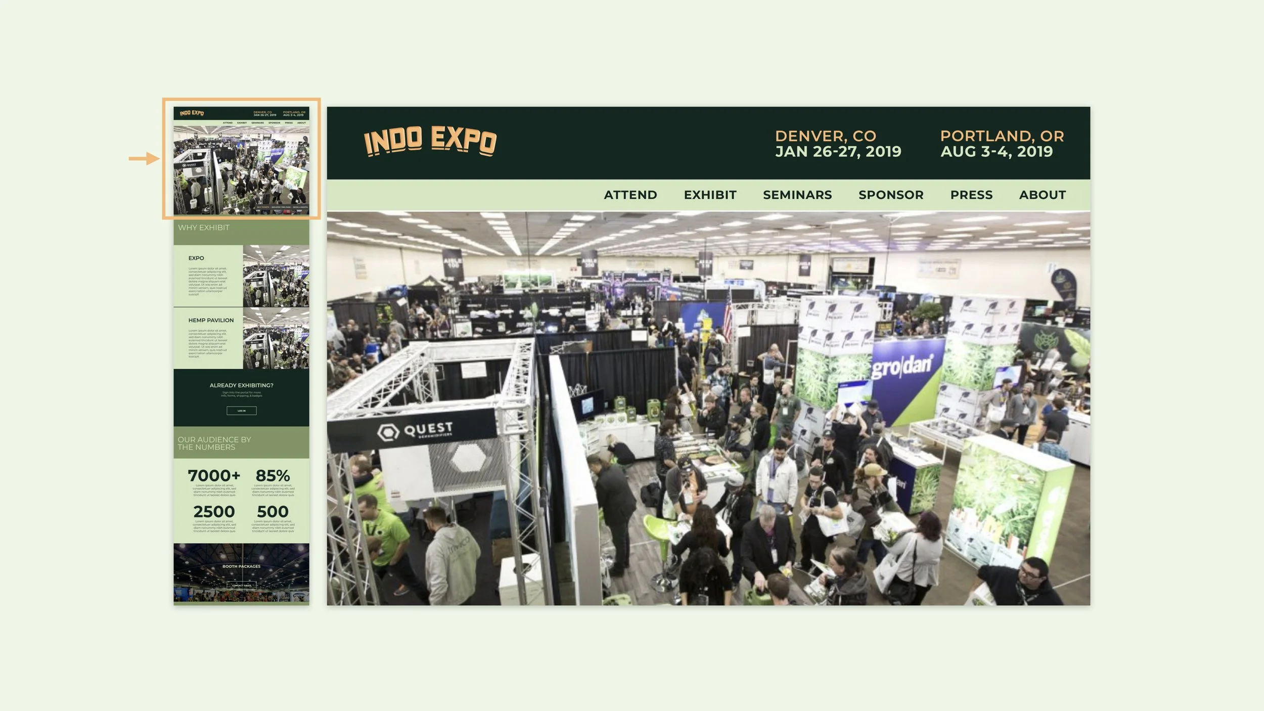
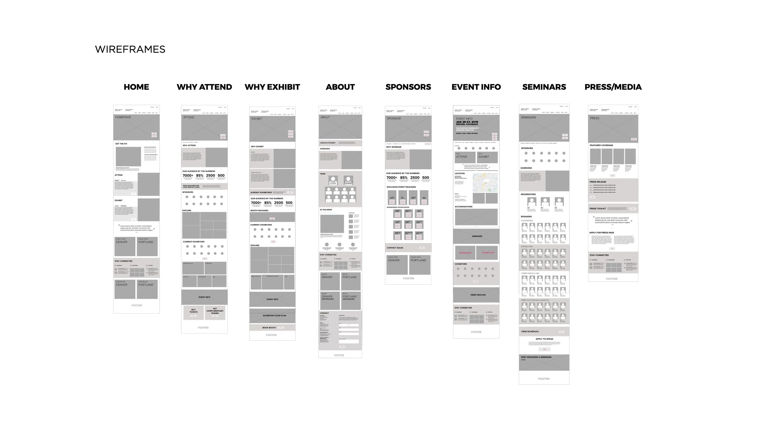
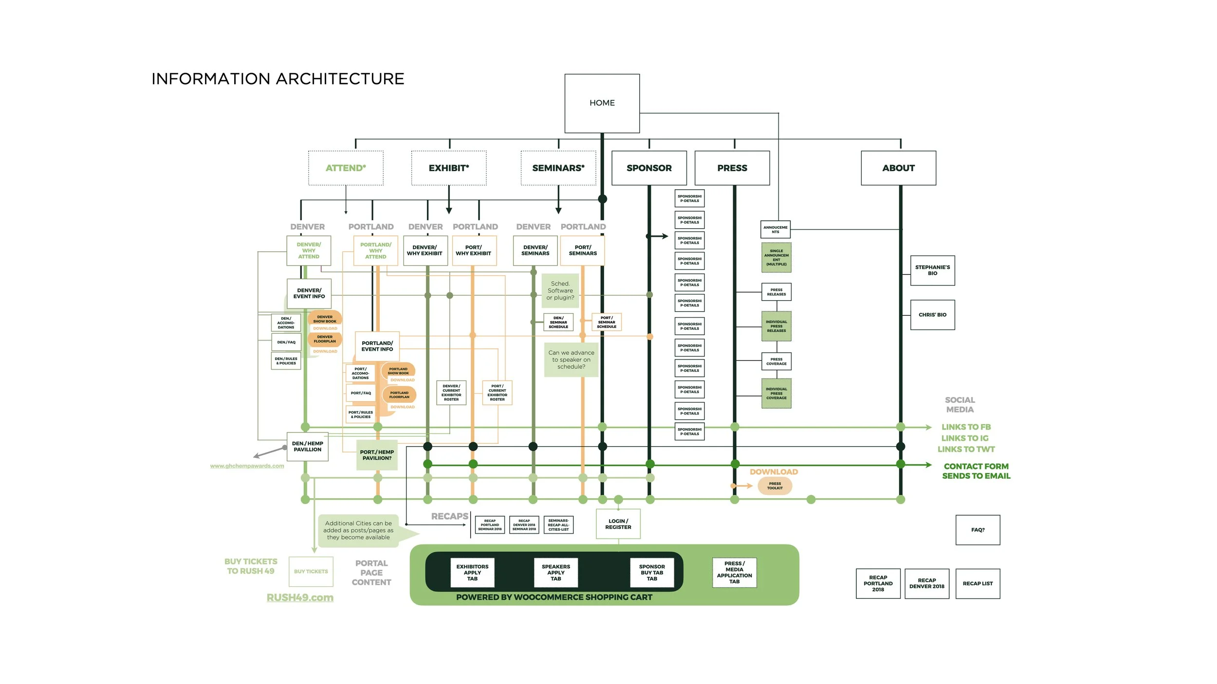
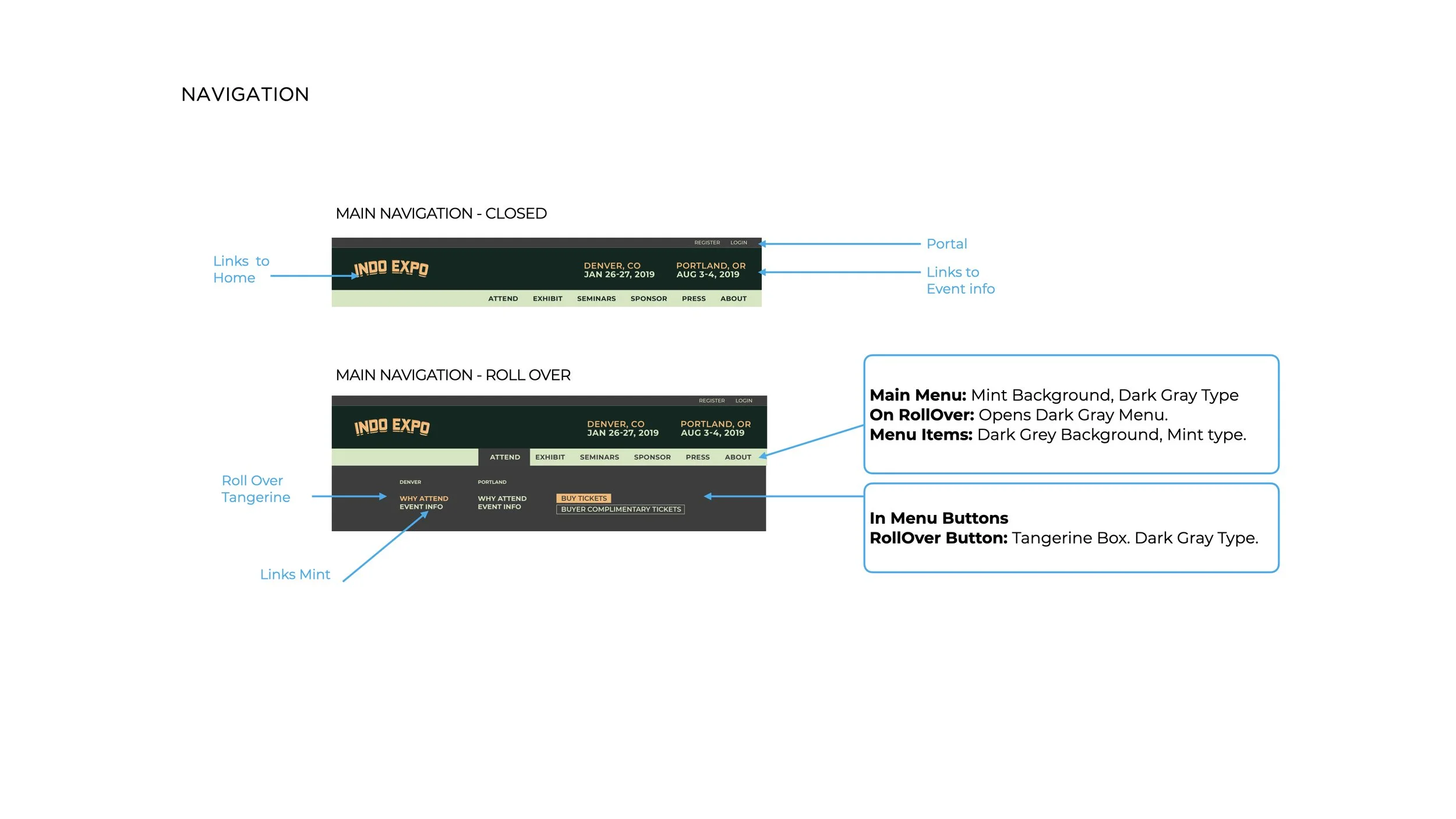
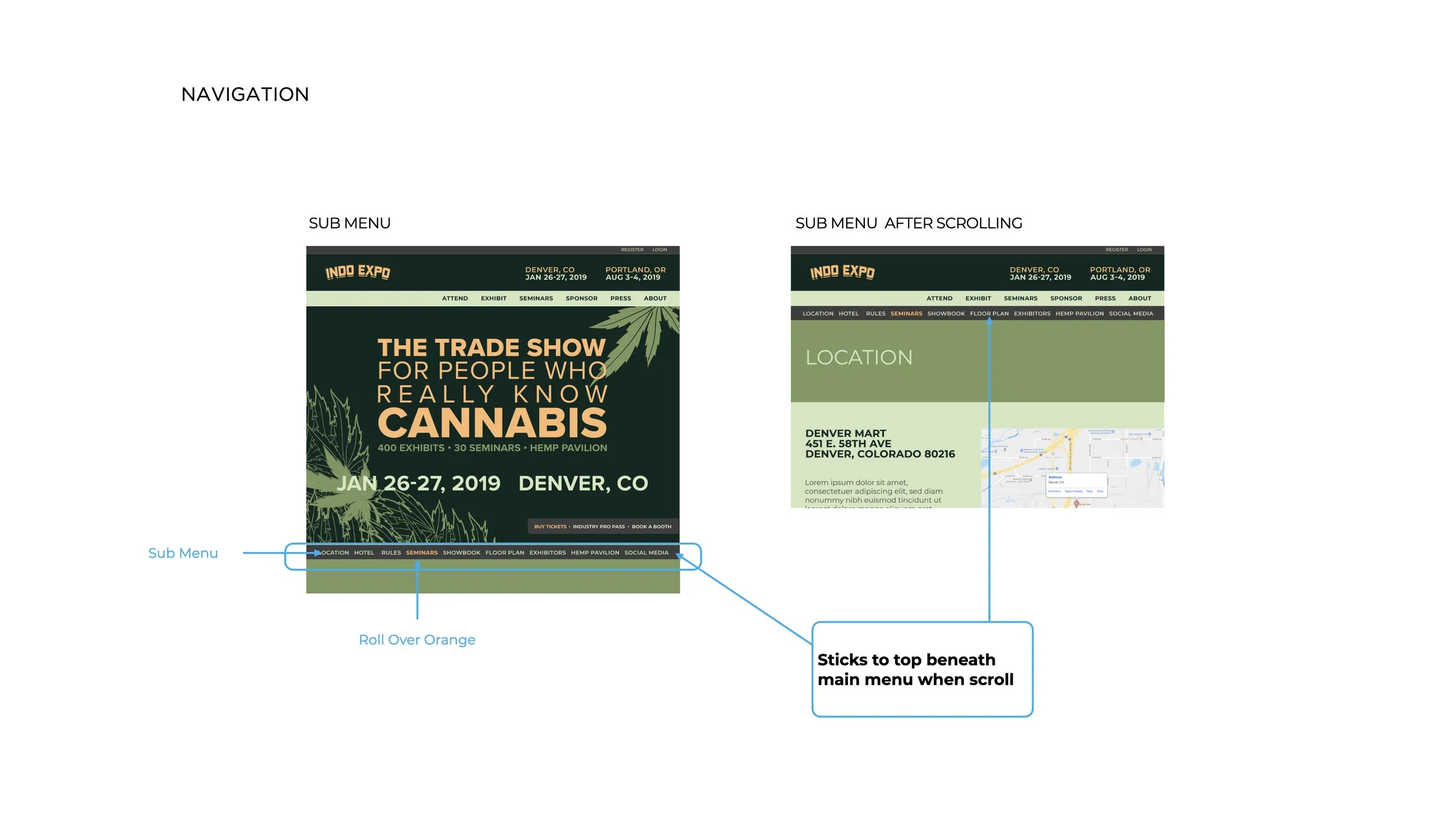
Website
Information Architecture
Wireframing and Prototyping
Custom Website Development
Front-end and Back-end Development